
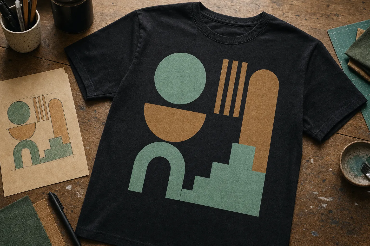
A great custom T-shirt does not start with a fancy app or a perfect piece of artwork. It starts with one clear idea: who is this for, and what should it make them feel? When you answer that first, the colors, words, graphics, and placement get much easier to choose. Whether you are making one shirt for yourself, a gift, a celebration, or a group, this guide helps you shape an idea that feels personal instead of piled on.
1. Start with the reason someone will wear it
Before you choose a font or a color, give the shirt a job. Is it a birthday surprise, a family trip memento, a team shirt, a memorial, a small-business piece, or simply a design that sounds like you? The answer sets the mood. A shirt made for a loud weekend celebration can be playful and bold. A shirt meant to become a favorite everyday piece may need a quieter detail that still feels special.
Write one short sentence that describes the feeling you want. Try “funny without being messy,” “soft and personal,” or “easy to spot from across the room.” That sentence becomes your filter. If an element does not support it, let it go. A design with one good idea nearly always looks more confident than one trying to explain everything at once.
2. Pick one main message or visual
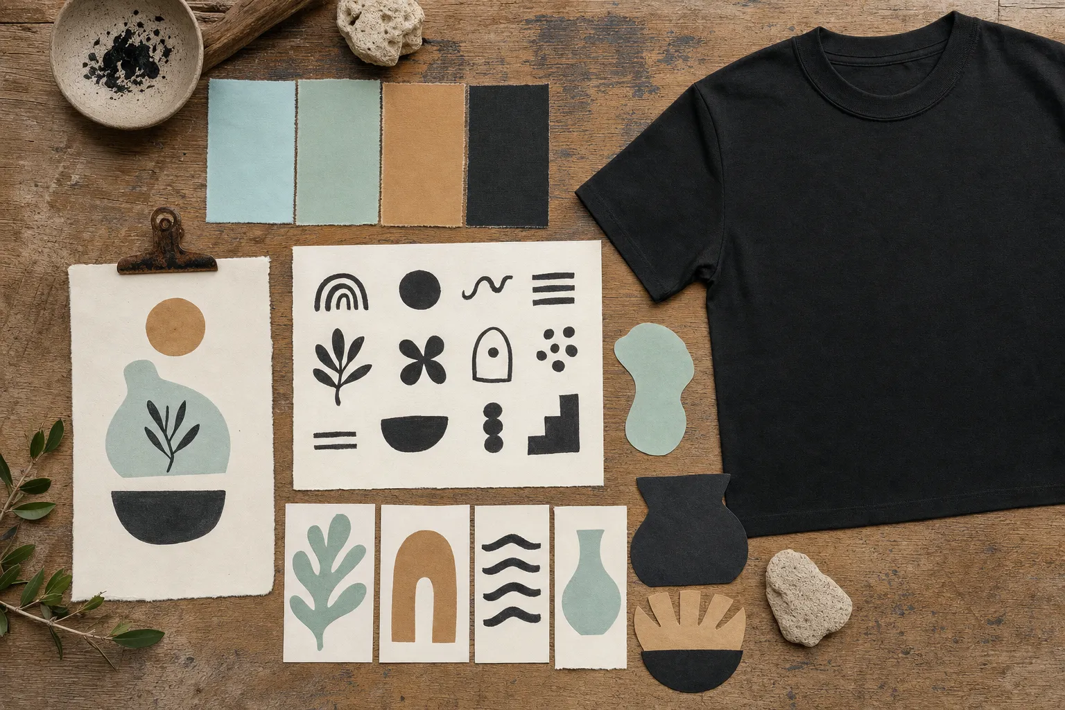
Every memorable shirt has a first thing your eye lands on. It might be a name, a date, a short phrase, a mascot-style graphic, a photo, or a simple symbol. Pick that focal point before adding supporting details. Then ask what can make it easier to notice: size, contrast, space around it, or a small accent color.
If words are the star, keep them readable before you make them decorative. A clever phrase nobody can read at a glance loses its punch. If the artwork is the star, give it room to breathe rather than boxing it in with extra captions. A little empty space is not wasted space, it is what lets the main idea feel intentional.
3. Let the shirt color do some of the work
The shirt is part of the design, not just a background. Dark shirts can make light artwork pop. Light shirts can make darker graphics feel crisp. A warm shirt color can make a simple black design feel more relaxed, while a high-contrast combination can feel bolder and more graphic. Think about where the shirt will be worn, too. A design for a sunny event may need different contrast than a design for a casual indoor gathering.
Use a short palette instead of every color you love at once. One main color, one supporting color, and one small accent are often enough. When you already have a photo or a logo, pull one or two colors from it instead of adding unrelated ones. That simple move makes the whole piece feel tied together.
4. Choose placement based on the vibe, not a default
Placement changes the personality of a shirt. A small left-chest detail feels like a subtle signature. A centered front design feels direct and classic. A larger front graphic makes the shirt the conversation starter. A back design can feel especially good for group shirts, events, or a piece with a bigger message. There is no universal “right” placement. There is only the placement that supports the point of your shirt.
Picture the shirt on a real person, not just on a flat screen. Does the design need to be noticed from a few steps away, or is it a detail someone discovers up close? Keep type away from areas where folds can make it harder to read. When in doubt, a simple placement is a strong choice. The practical placement guidance in this custom T-shirt file and placement guide is a helpful reference, but the best final choice is the one that fits your specific garment and artwork.
5. Make the design easy to read from the right distance
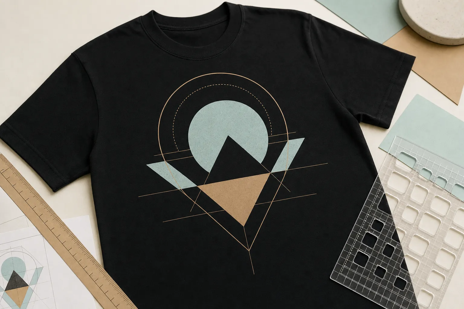
Not every shirt has to shout, but every shirt should be readable for the setting it is made for. A tiny line of text may work as a personal detail near the chest. It will not work as the whole message for a reunion shirt photographed across a park. If you are unsure, look at the design smaller than your screen view. Can you still tell what matters first? If not, increase contrast, simplify the type, or make the main element larger.
Be careful with details that are beautiful only when zoomed in. Very thin lines, tiny type, and delicate texture can lose their magic when they move from a screen to fabric. That does not mean you need to make everything chunky. It means the small details should support a clear bigger shape.
6. Use a rough sketch or reference, even if you are not a designer
You do not need polished artwork to begin a custom order. A photo of a handwritten sketch, a saved color combination, a screenshot of an inspiration piece, or a note with the words you want can all start a useful conversation. The goal is not to hand over a finished blueprint. The goal is to communicate the feeling behind the idea.
Make your reference specific enough to be useful. Instead of saying “make it cute,” point to what you like: the rounded lettering, the high contrast, the clean layout, the retro feel, or the playful color. If you are working in a design tool, taking time to preview the idea on a shirt can reveal whether it needs more contrast or breathing room. Canva’s shirt mockup walkthrough shows one way to create a mockup before printing.
7. Keep the final handoff simple
When you are ready to bring your idea to life, share the information that removes guesswork: what the shirt is for, the color you are imagining, the wording or images that matter, how many shirts you need, and any must-keep details. If you have a deadline, say it early. If you have no finished artwork, say that too. Honesty gets you to a better result faster than pretending the file is final.
If you have a logo or artwork, send the clearest version you have. A transparent file can be useful for artwork that needs to sit cleanly on the shirt, while a small screenshot might be enough to explain a concept. The right file depends on the artwork and print approach, so asking before you spend hours rebuilding anything is a smart move.
How Brooklyn’s Custom Designs helps you make it personal
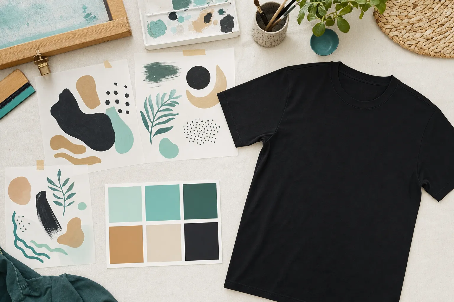
The whole point of custom work is that it does not need to look like everyone else’s. Brooklyn’s Custom Designs LLC makes room for your idea, whether you arrive with a finished design or a starting point that needs shape. Start with custom T-shirts when the idea belongs on something wearable. A favorite phrase can also become a custom decal, and an occasion-led idea may fit one of the personalized custom items.
Ready to put the pieces together? Send the idea, even if it is only a sketch and a feeling, through the custom-order page. The best custom shirt is not the one with the most stuff on it. It is the one that feels immediately, unmistakably yours.
Frequently asked questions
What should I put on a custom T-shirt?
Start with the reason for the shirt, then choose one message or image that carries it. A name, an inside joke, a team moment, a birthday theme, or a favorite saying can all work when the design has one clear focal point.
Do I need a finished design before I order a custom T-shirt?
No. A rough idea, a photo, a color preference, or a sketch is a useful place to begin. The clearer you can be about the feeling and occasion, the easier it is to make choices about the final look.
How big should a design be on a T-shirt?
That depends on the job of the design. A small chest detail feels subtle and personal. A centered front design makes a stronger statement. Choose the placement after deciding what someone should notice first.
Can I use more than one color in a T-shirt design?
Yes, but more colors do not automatically make a design stronger. Use color to create contrast, guide the eye, or support the feeling of the shirt. If every element is competing, simplify before adding another color.